

.jpg?sfvrsn=3df2d46f_3)
Summary:
The Fed has resumed rate cuts, citing slowing job gains and downside risks to employment. This comes despite elevated inflation and a still-growing economy.
Want a broader view of this quarter’s trends? Download the full market outlook for insights across the economy, equity, and private markets.
Our Perspective:
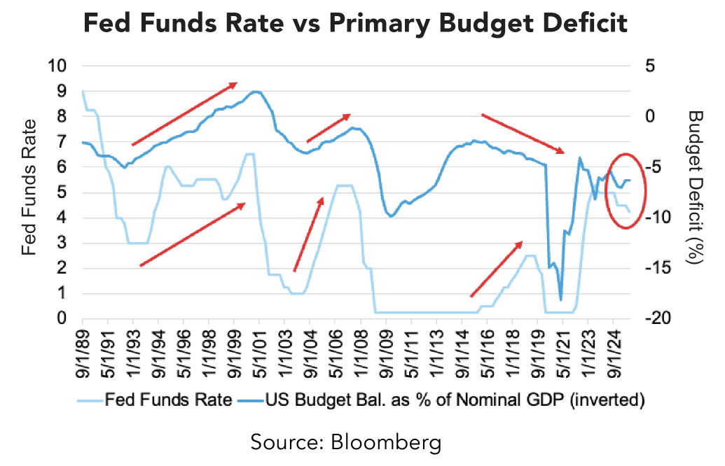
The fiscal dominance (when deficits and debt dynamics limit monetary policy’s room to maneuver) described in the third quarter outlook is now being met with more accommodative monetary policy in light of the economic headwinds faced by a tighter labor market.
The market response to the resumption of rate cuts by the Fed has presented an opportunity to reposition the fixed income allocation of most multi-asset portfolios to take advantage of yield curve steepening and higher term premiums (the extra yield investors demand to hold longer bonds).
Is Policy Late - Or Right on Time?
The second and third quarters of the year have been bookended by fiscal actions that have added significant difficulty to the work of the Fed in restoring price stability within the economy.
First and ongoing has been the use of trade policy as a diplomatic tool. The trade-weighted average tariff rate currently stands at 18% (8% if we exclude court-challenged tariffs) domestically. This situation adds burdensome challenges to businesses that require stable input prices in order to make long-term investments and commit to capital projects.
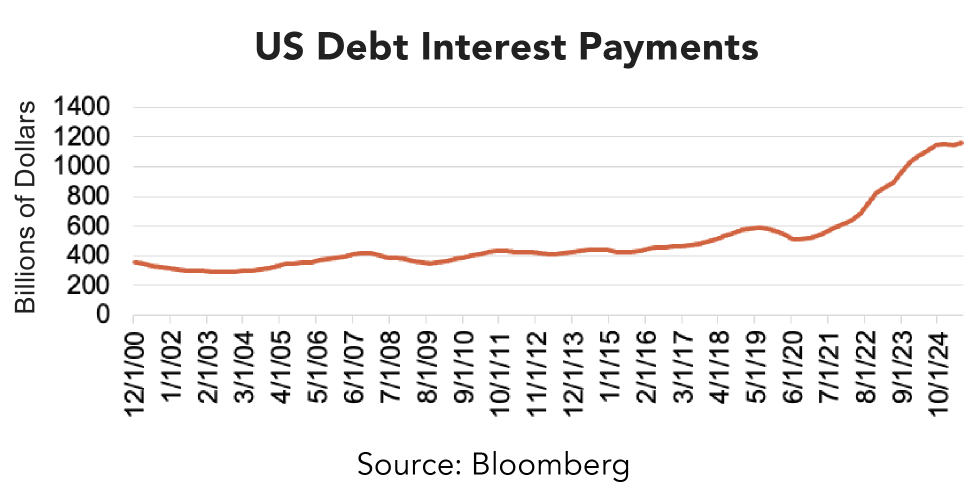
This was followed by debate over the persistently large and growing fiscal deficit, a more significant portion of which has become the interest on the debt used to finance it. This is not only a US problem, but a problem for the bulk of the Group of Seven (G-7) economies around the globe.
This is the situation in which the Federal Open Market Committee (FOMC) finds itself. After remaining on pause and assessing the cumulative impact of the 1% rate cut delivered in 2024, the FOMC resumed cuts in September, lowering the overnight rate by 0.25%, penciling in two more quarter-point rate cuts for the remainder of this year and two more for 2026.
Growth Firm, Labor Softer: The Split Screen
It’s unusual that fiscal and monetary policy are loosening while the economy is growing at 3.8% in inflation-adjusted terms, but that is the current situation.
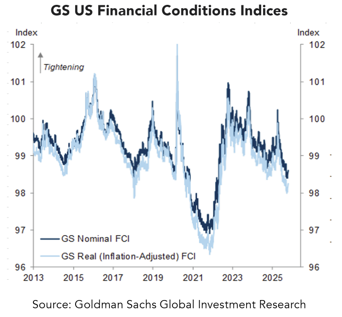
In fact, evidence is mounting that financial conditions have become looser, and economic data has generally surprised to the upside, especially as services inflation continues to march lower incrementally. This is despite the fact that there are credible and tangible signs of a weakening in labor market conditions, which have largely served as the rationale for the FOMC’s recent moves.
What’s more, Jason Thomas, Carlyle Group’s (a major private equity firm) head of Global Research and Investment Management, recently stated, What’s so interesting about the moment we’re in is the discrepancy between payrolls and the other economic indicators we’re looking at,
referring to the weakening jobs data despite other indicators broadly portraying resilience.
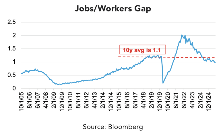
Recently, the number of jobs available to unemployed workers dipped below 1 to 0.98. The jobs/workers gap, as the measure is more colloquially known, is a key barometer of labor supply and demand and is often cited by FOMC members in the context of the health of the labor market. Additionally, the number of temporary help services payrolls, a leading indicator of labor market health, has deteriorated to about 2.5 million. These levels are similar to those of late 2012, when the economy was still recovering from the financial crisis.
Just Do the Twist
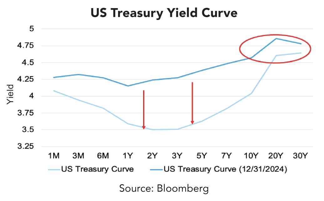
The proposed fiscal solution to the issues of trade, deficits, and the cumbersome debt servicing costs has been to skew treasury issuance to the short end of the yield spectrum. The observed effect has been a stickiness in long-term rates, albeit lower than one would otherwise expect, and a steepening in the yield curve.
Separate from issuance strategy choices, the uncertainty around whether trade will be freer and/or austerity measures taken makes it exceedingly difficult for a central bank with an explicit dual mandate of price stability and full employment to operate. Thus, the FOMC has elected to prioritize the employment side of its mandate, while alluding to the risks associated with its often-overlooked third mandate of maintaining moderate long-term interest rates.
Given the moves in rates over the past nine months, the team felt that it would be optimal to reposition fixed income allocations to take advantage of these realities. The 3- to 7-year maturity portion of the Treasury curve (the ‘belly’) appears to be fully valued at this juncture; thus, we elected to take profits and reallocate these proceeds into mortgage-backed securities (MBS), long-maturity US Treasuries, and short-dated asset-backed securities (ABS).
MBS carry a desirable yield of 4.5% and provide protection should rates move higher. Longer-dated Treasuries, as discussed earlier, carry yields that have remained relatively high, and ABS, while possessing similar protections against rising rates, carry a yield closer to 5%.
It’s important to note that these changes further enhance the resilience of client portfolios by focusing the already limited credit risk on the very short end of the yield curve, while interest rate sensitivity is added via the allocation of long-end Treasury notes.
This positioning should allow our clients to take advantage of the steepening of the yield curve, while also hedging against any prolonged weakness in labor market conditions. We will continue to monitor these developments in the macro economy and reposition fixed income allocations to serve as a source of safety and liquidity.
Resilient portfolios start with intentional positioning. Connect with a Midland Wealth Advisor to review your fixed income strategy and explore opportunities for balance and protection.